natwest
natwest
Problem
Problem
I had to overhaul NatWest’s community hub while stuck inside an old, rigid design framework that produced safe but lifeless, “corporate” experiences users didn’t connect with.
I had to overhaul NatWest’s community hub while stuck inside an old, rigid design framework that produced safe but lifeless, “corporate” experiences users didn’t connect with.
Solution
Solution
I pushed for a more liberal visual and UX direction, teamed up tightly with the UX crew, and brought in unconventional but on‑brand patterns shaped directly by user feedback.
I pushed for a more liberal visual and UX direction, teamed up tightly with the UX crew, and brought in unconventional but on‑brand patterns shaped directly by user feedback.
Outcome
Outcome
The redesigned hub contributed to user growth from 650k to 1.6 million over 24 months
The redesigned hub contributed to user growth from 650k to 1.6 million over 24 months
Year
Year
2021
2021
Industry
Industry
Finance
Finance
Scope of work
Scope of work
/
App Design
App Design
Timeline
Timeline
5 months
5 months
Discovery
Discovery
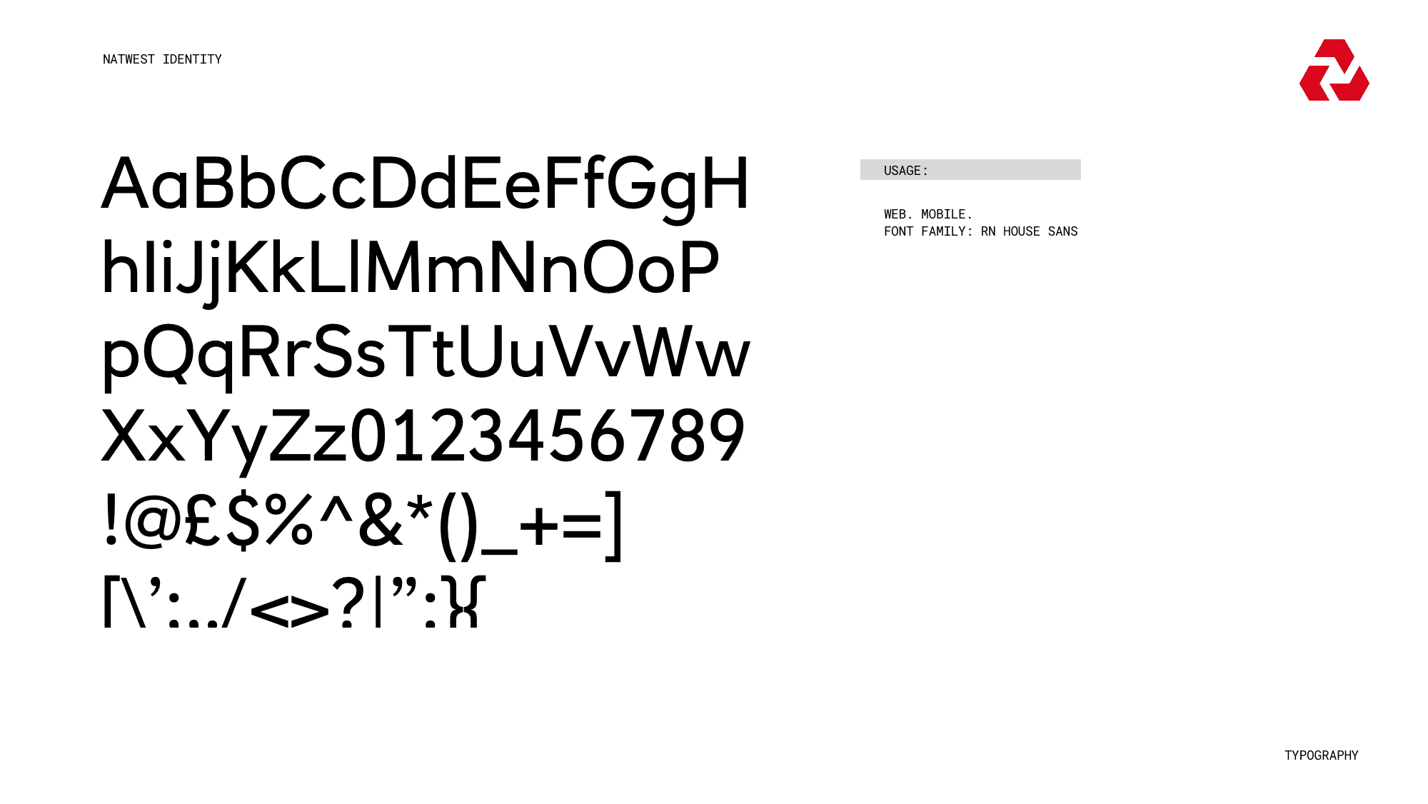
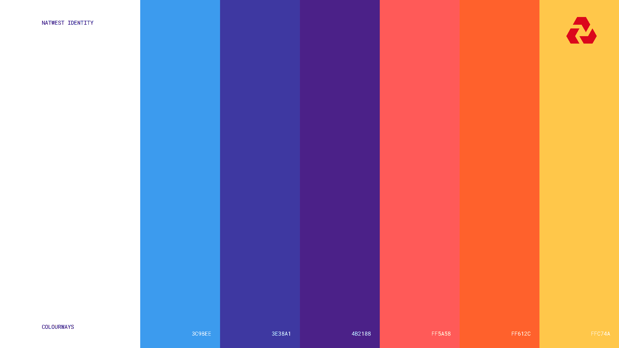
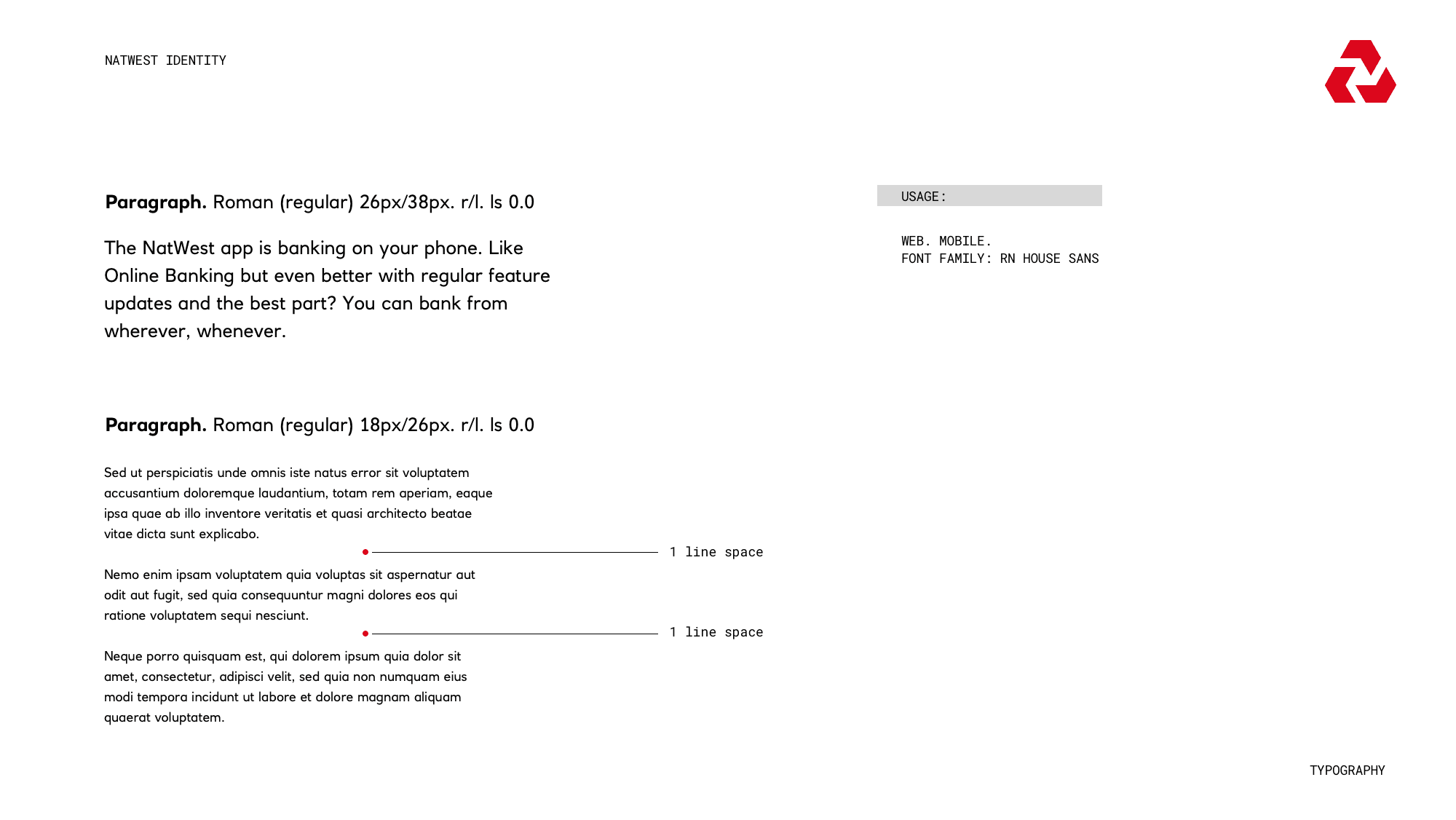
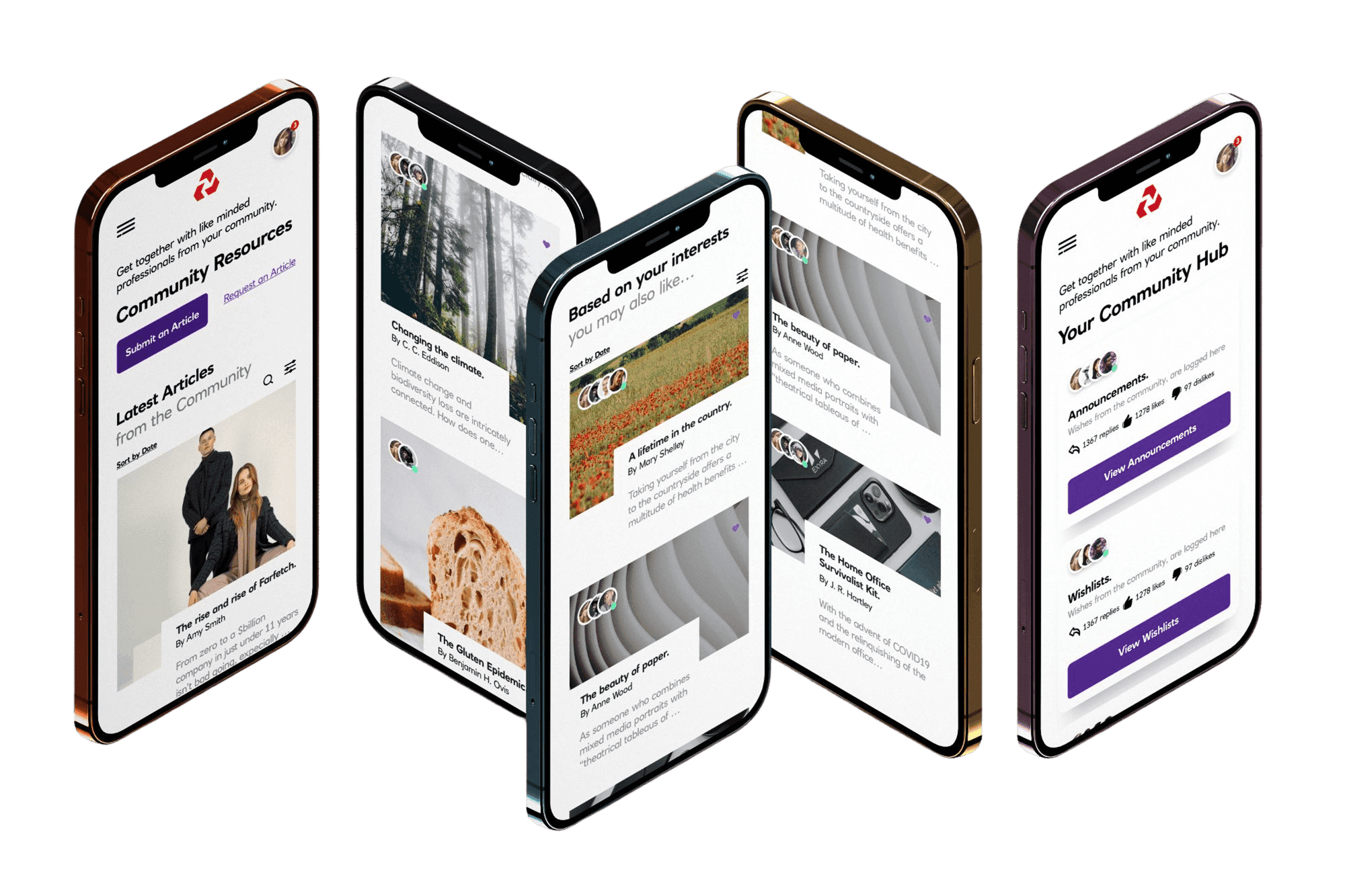
In discovery, it became clear that the existing design system was both my starting point and my cage. The rules were non‑negotiable: I could introduce new components, but I couldn’t change core styles—no new colours, typography, or spacing primitives.
That meant I had to treat the system as a fixed language and focus on saying something new with the same alphabet.
Discovery
Discovery
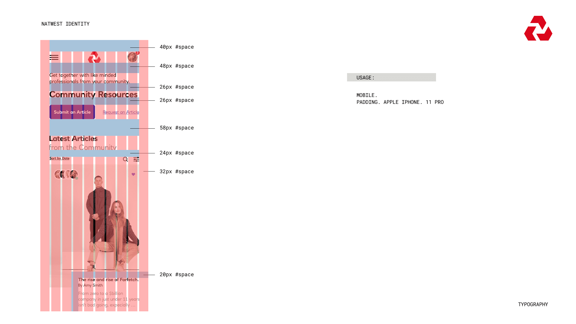
I audited the current flows, UI patterns, and content to see how far the existing tokens and components could stretch.
Anywhere the experience fell short, I looked for ways to recombine what we already had; nesting, sequencing, and resizing components to create fresh patterns that still passed the brand sniff‑test.
The goal wasn’t to fight the system, but to prove that within its limits we could still ship something that felt warmer, and more modern.
Discovery
Discovery
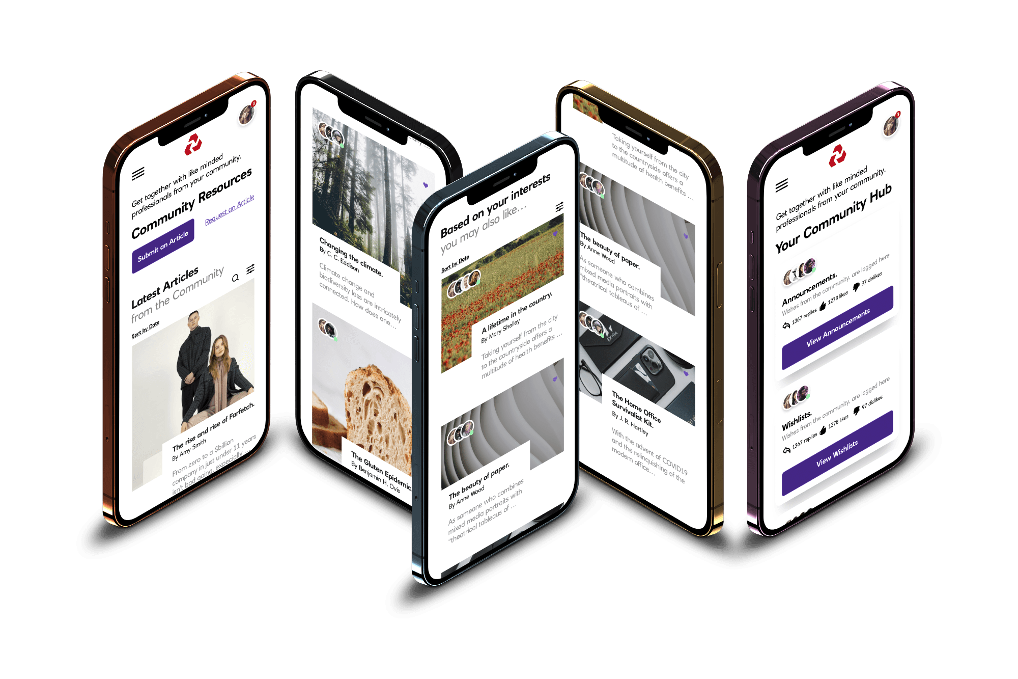
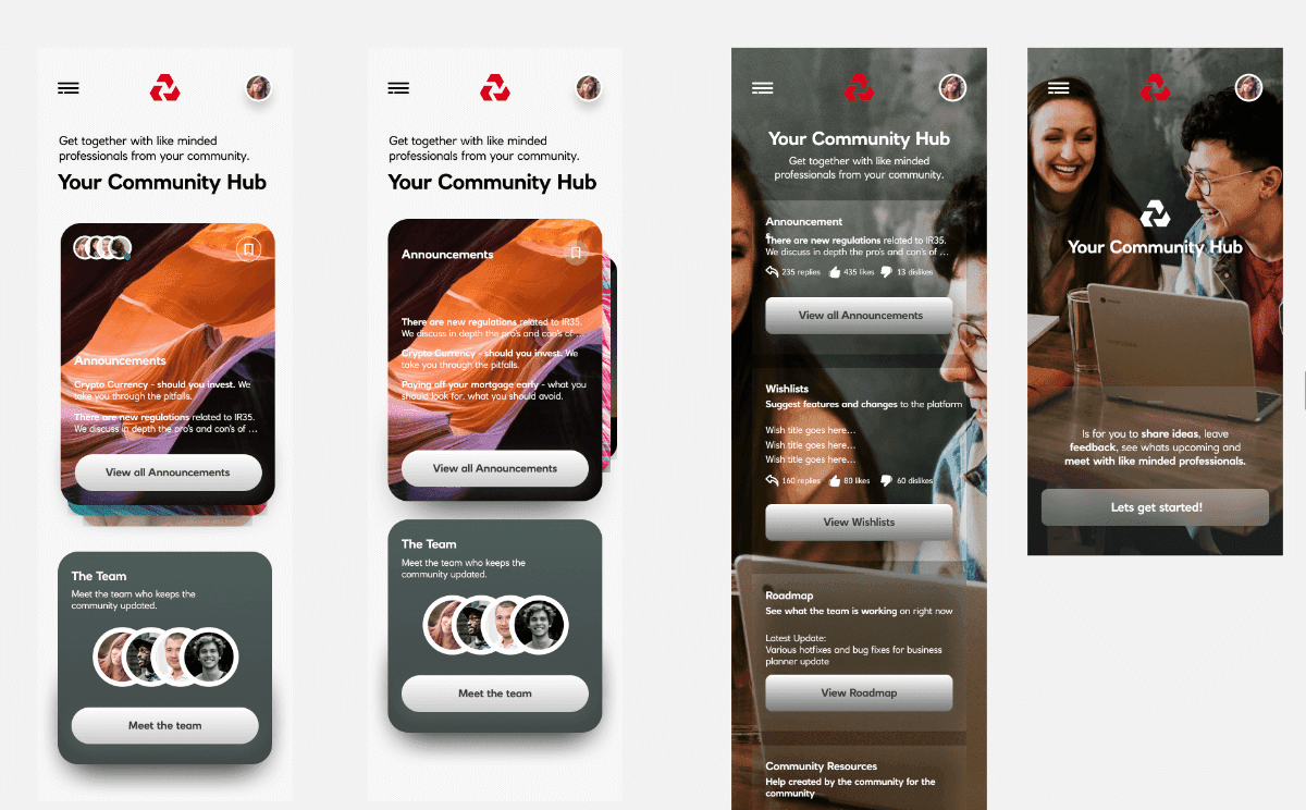
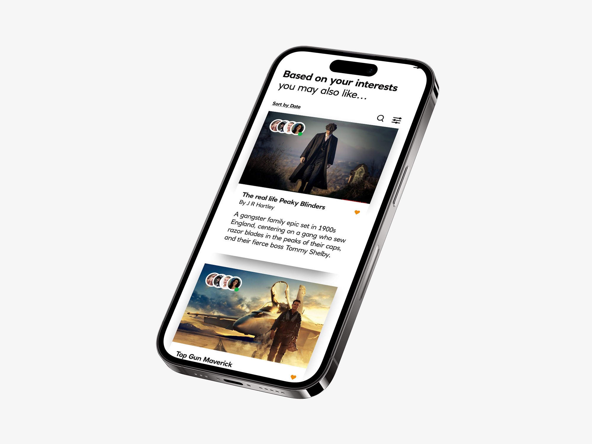
I started with a few concepts using photographic backgrounds and translucent panels, but they raised accessibility concerns.
So I shifted to a white canvas and experimented with vertical, swipeable carousels, which felt visually more interesting.
I started with a few concepts using photographic backgrounds and translucent panels, but they raised accessibility concerns.
So I shifted to a white canvas and experimented with vertical, swipeable carousels, which felt visually more interesting.
I started with a few concepts using photographic backgrounds and translucent panels, but they raised accessibility concerns.
So I shifted to a white canvas and experimented with vertical, swipeable carousels, which felt visually more interesting.
I started with a few concepts using photographic backgrounds and translucent panels, but they raised accessibility concerns.
So I shifted to a white canvas and experimented with vertical, swipeable carousels, which felt visually more interesting.
Discovery
Discovery
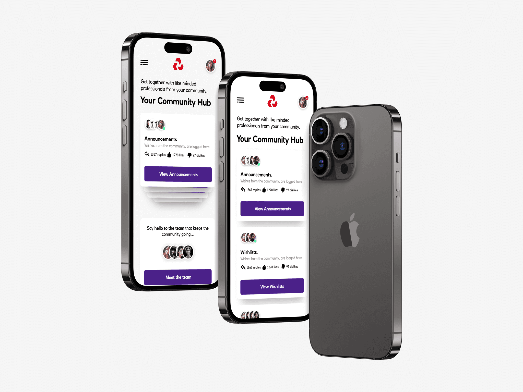
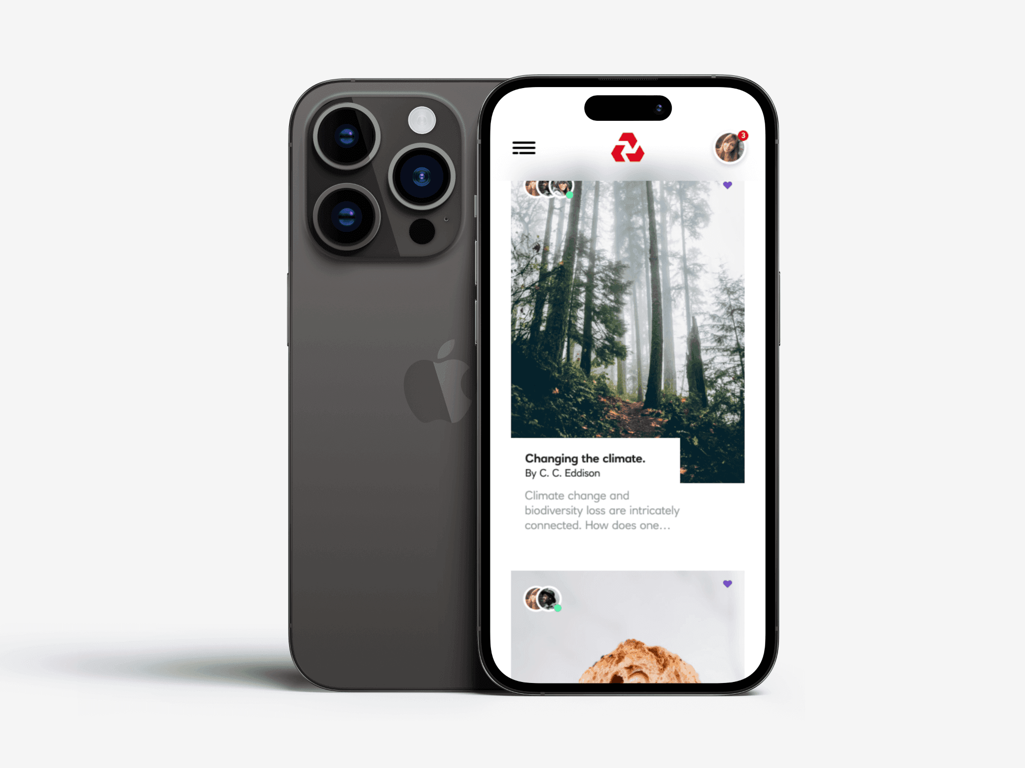
From there I committed to the white background, which gave everything more breathing room.
It felt the most premium, almost “Medium‑esque” , by letting all the elements sit together in a way that felt natural and right.
From there I committed to the white background, which gave everything more breathing room.
It felt the most premium, almost “Medium‑esque” , by letting all the elements sit together in a way that felt natural and right.

Discovery
Discovery
Discovery
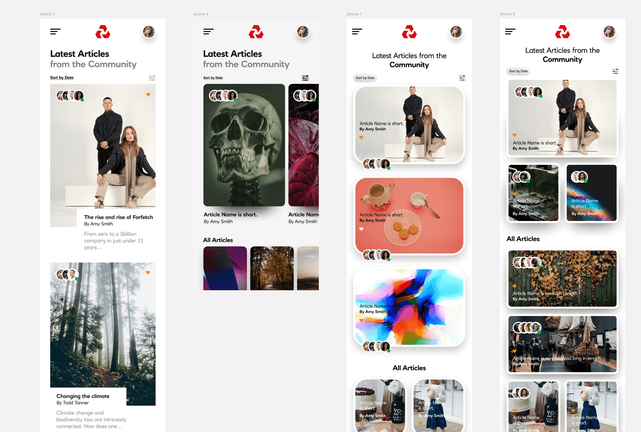
With the full set of wires done, I pushed the journeys through to a finished state. The client was happy and signed off on the initial design direction.
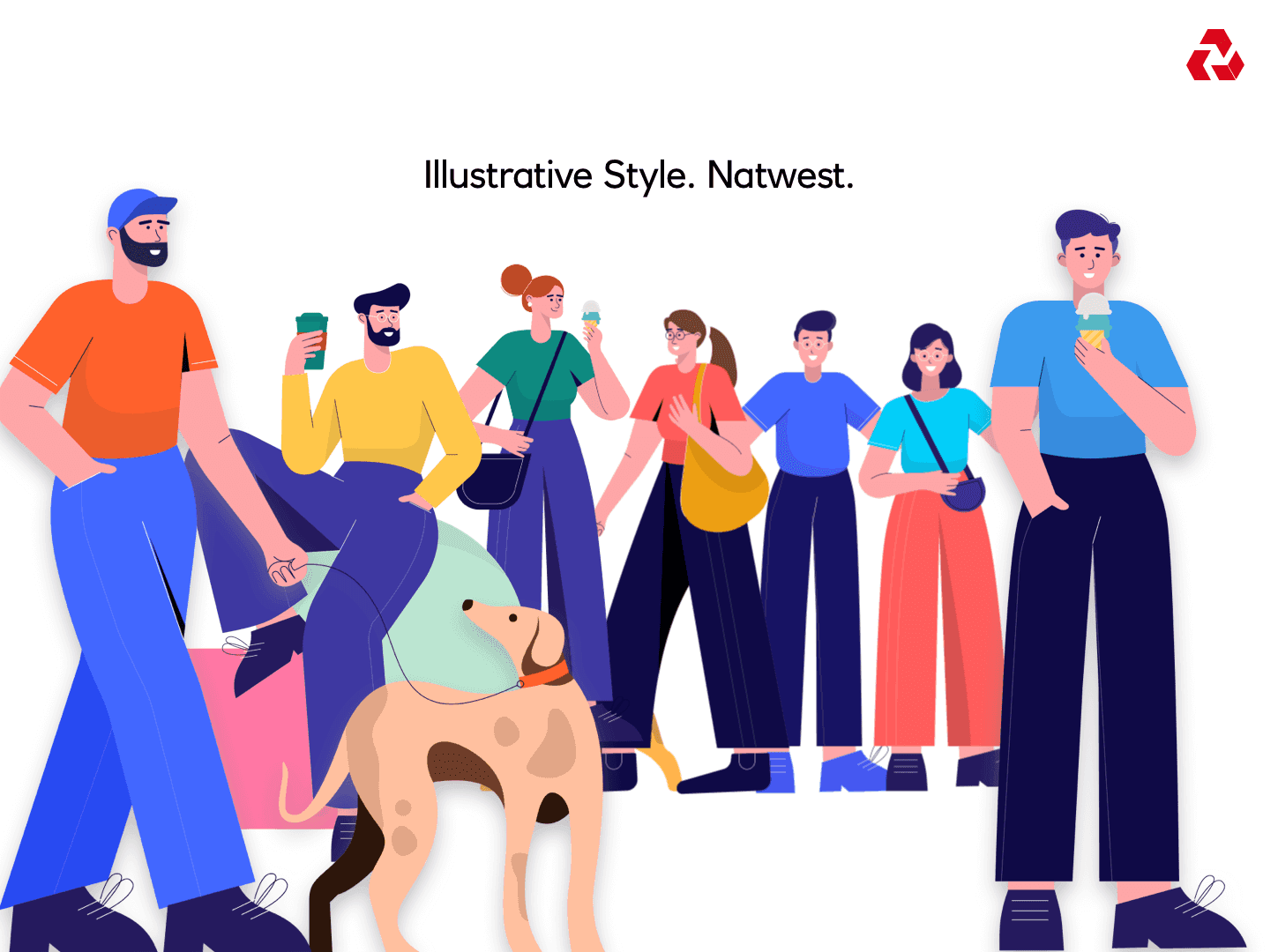
I wrapped that first style, then was given a few extra weeks to explore a second route. This one leaned into a more illustrative look, giving the brand a more distinctive, characterful feel
With the full set of wires done, I pushed the journeys through to a finished state. The client was happy and signed off on the initial design direction.
I wrapped that first style, then was given a few extra weeks to explore a second route. This one leaned into a more illustrative look, giving the brand a more distinctive, characterful feel
Illustrations
Illustrations
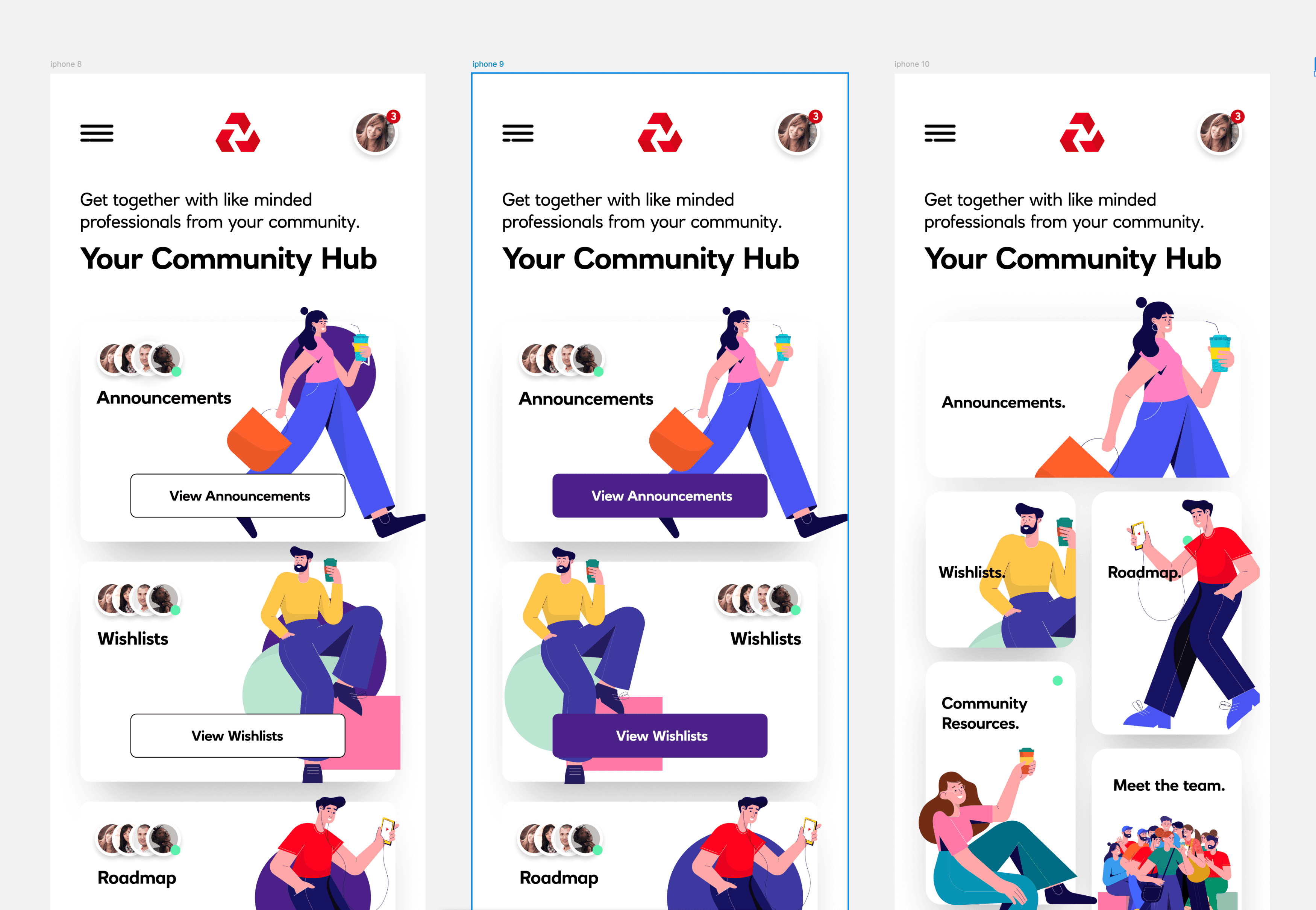
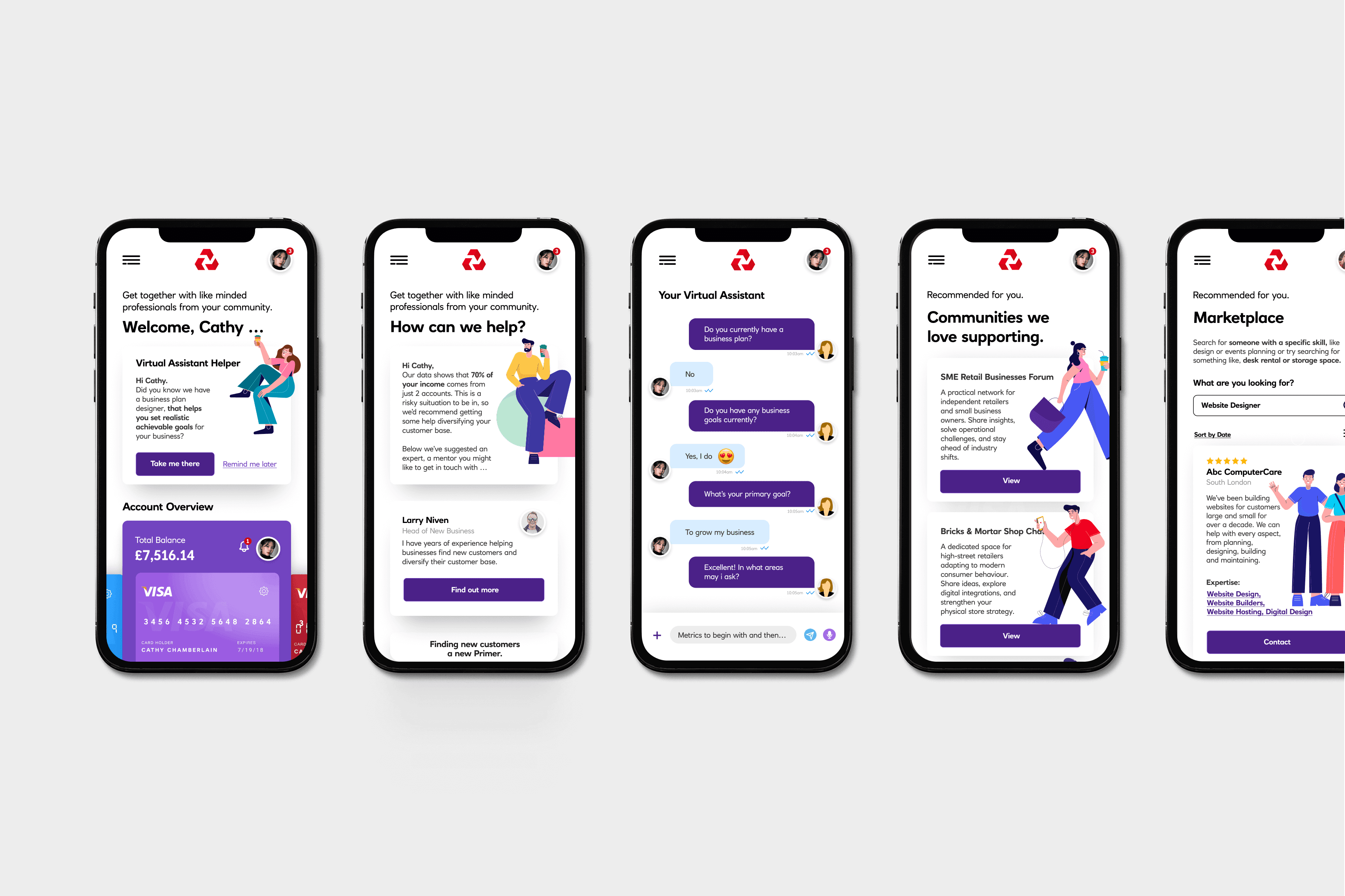
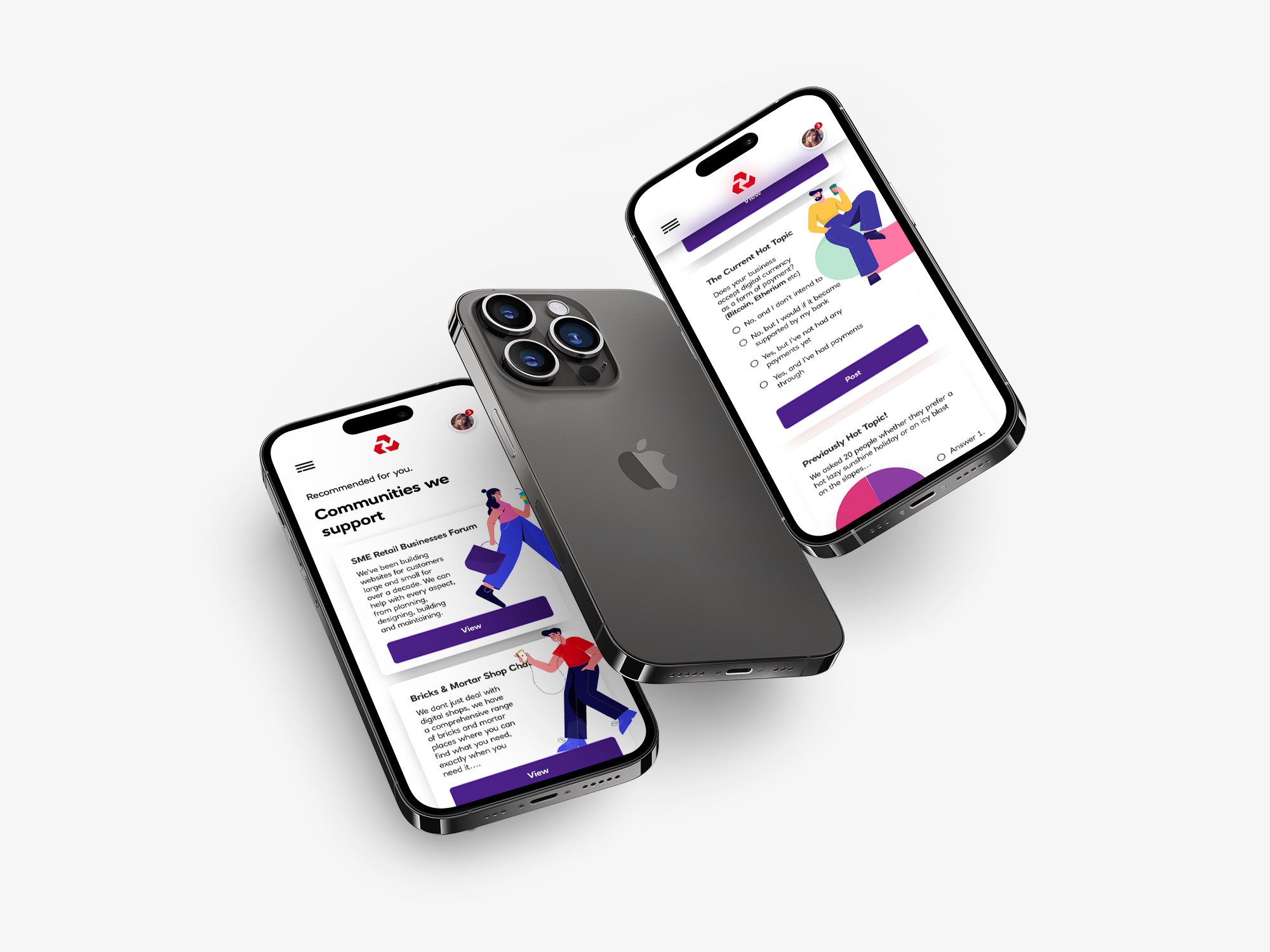
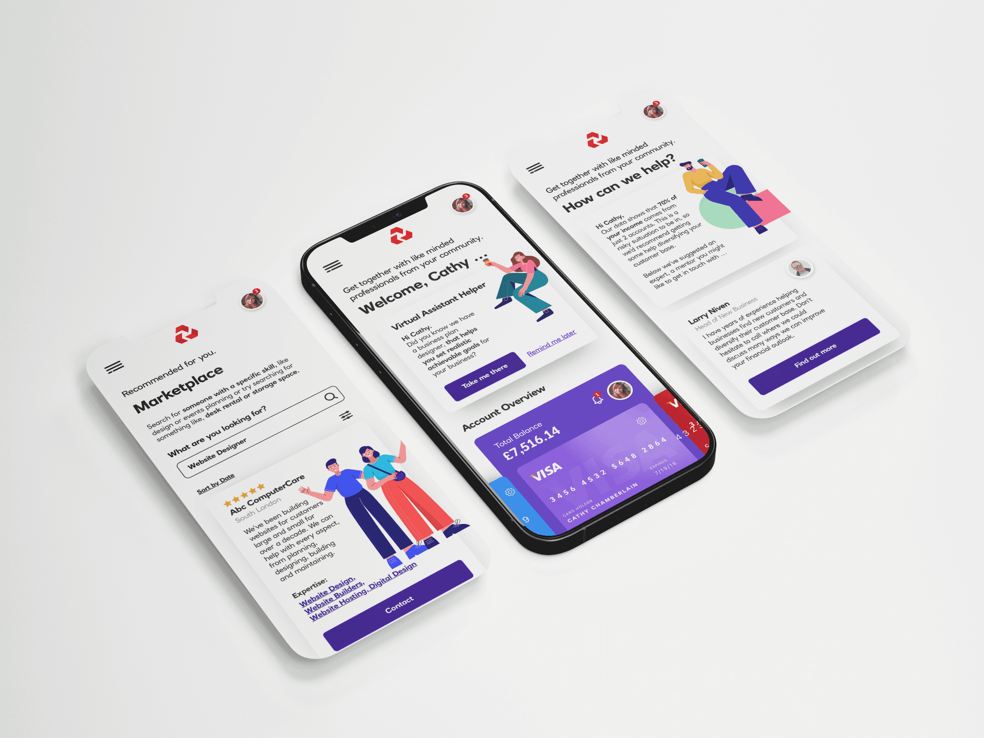
I found an artist online that fitted the bill and we commissioned a set of stand alone figures made of young men and women (and dogs) set in a serious of happy, confident poses.
I found an artist online that fitted the bill and we commissioned a set of stand alone figures made of young men and women (and dogs) set in a serious of happy, confident poses.
Illustrations
Illustrations
These landed really well, fitting neatly within NatWest’s colour palette and giving the team a second, distinctive style they could confidently lean on.
These landed really well, fitting neatly within NatWest’s colour palette and giving the team a second, distinctive style they could confidently lean on.
To completion
To completion
Both routes tested strongly, and the illustrative style was ultimately chosen.
Both routes tested strongly, and the illustrative style was ultimately chosen.
Both routes tested strongly, and the illustrative style was ultimately chosen.
(2014-26)


Let’s talk.
Tell me about your project-whether it’s a app, website, product creation or a build with Ai.
Quick response.
If you’re ready to create and collaborate, I’d love to hear from you.

Lead Product Designer
Moodflo
Michael Ruocco
Let’s talk.
Tell me about your project-whether it’s a app, website, product creation or a build with Ai.
Quick response.
If you’re ready to create and collaborate, I’d love to hear from you.
Lead Product Designer
Moodflo
Michael Ruocco